Denotion
lib.er.ate® exists to liberate brands from the ordinary. With our expertise in design and marketing.
Branding Web design
2024

Overview
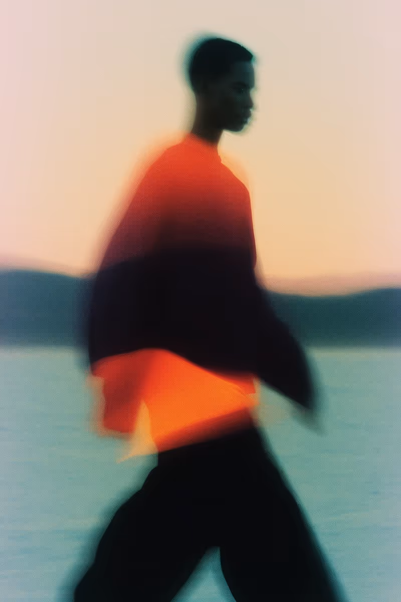
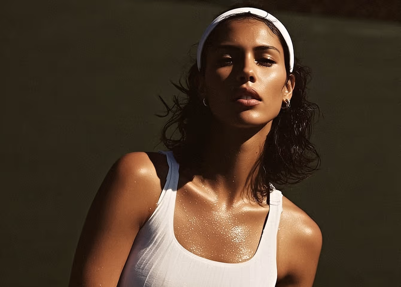
Denotion is a next-generation performance brand blending sport, science, and streetwear. Built for athletes who train with intent, Denotion needed a visual identity that felt both technical and bold Creating a balance between discipline and energy.


Approach
We began with strategy, defining Denotion’s position as a high-performance brand rooted in clarity, movement, and control. From there, we designed a modular identity system built on a bold typographic foundation, structured layout principles, and a muted, utilitarian color palette.
Solution
A custom logotype built from condensed forms with subtle motion references
A monochrome primary palette, expanded with seasonal accent colors
Modular layout grids and dynamic type scales for campaigns, UI, and packaging
Art direction guidelines for photography: contrast, motion blur, urban textures
Tone of voice: clear, minimal, confident


Partners in creativity
“Working with Studio Verno brought clarity to our direction and depth to our identity. Their approach was thoughtful from the start. Strategic conversations, precise execution, and A design system that feels expressive and is built to grow with us.”
Maria D.
Brand Strategist at Denotion

outcome
The new identity launched alongside Denotion’s flagship product line and digital platform. It’s since been applied across retail packaging, app design, content campaigns, and athlete partnerships helping the brand grow its presence in both competitive sport and lifestyle markets.